
Why this matters—and what’s broken
Stores, museums, and urban façades scream for attention but too often deliver noise: bulky displays that hide products, backlit posters that feel dead, or screens so reflective they ruin the moment. That failure wastes budgets and dilutes messages. I’ve seen the fix firsthand at trade floors like CES in Las Vegas, where transparent panels stopped being a novelty and started resolving real layout and visibility problems—so designers began asking smarter questions about integration and sightlines. If your brief demands visibility without obstruction, the practical answer is a led transparent screen, but only when chosen and deployed with intention.
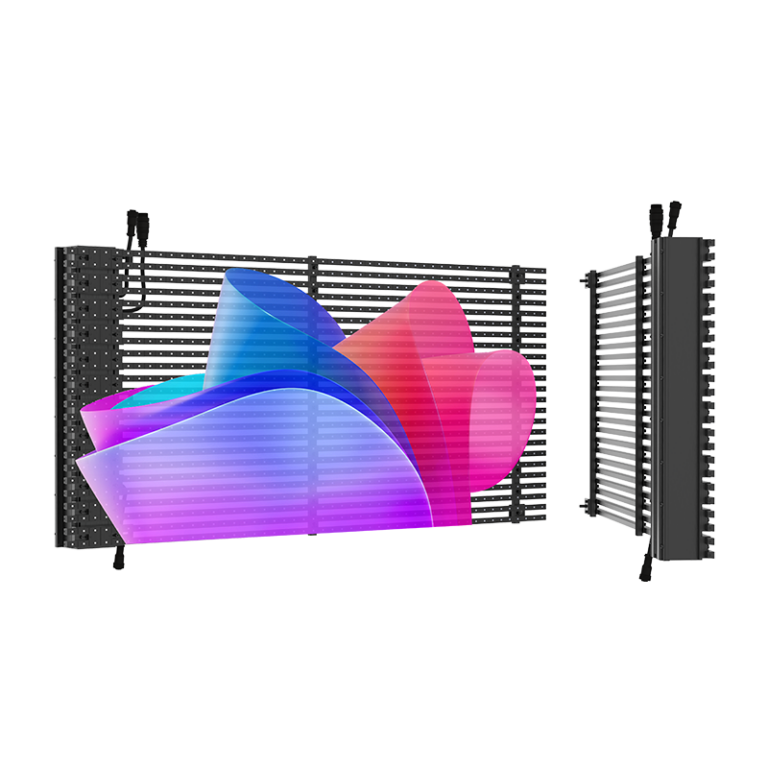
The precise problem-driven case for transparent LEDs
Conventional displays force you to choose: visibility or openness. Transparent LED screens break that binary by showing vibrant content while preserving physical sightlines. Yet they aren’t magic. They require honest alignment of use case, brightness needs, viewing distance, and structural support. If you treat them as a plug-in decorative gadget, they’ll underperform. Treat them as a solution to a specific spatial problem—showcase lighting, museum artifact protection, unobstructed storefront windows—and they deliver measurable engagement gains.
Key features to demand (no fluff)
Insist on these measurable specs: pixel pitch that matches typical viewing distance, peak brightness in nits for ambient conditions, transparency percentage for sightline preservation, high refresh rate to avoid flicker on camera, and robust mounting options to secure glass façades. Ask for certified power and thermal management details, plus tested IP ratings if the screen faces weather. Get sample footage shot against your actual backdrop before purchase—don’t accept studio demos as proof.

Common mistakes that kill performance
Teams pick the prettiest demo and hope for the best. They underspec brightness, forget camera-friendly refresh rates, or bolt heavy panels to weak frames. Others buy a high-transparency model then place it against a patterned backdrop that ruins contrast. Avoid over-polishing content: ultra-high-contrast graphics can look harsh in daylight and lose subtlety at night. Plan mounting, maintenance access, and emergency power from the start—retrofits cost far more than honest upfront planning.
Viable alternatives and when to pick them
Transparent LEDs aren’t always the right tool. Use rear-projection glass when you need deeper blacks and controlled indoor lighting. Choose high-brightness conventional LED façades for long-range outdoor signage where transparency isn’t required. Opt for printed/translucent film for permanent branding with no tech upkeep. Each option trades off visibility, maintenance, cost, and installation complexity—match the trade-off to your actual operational constraints.
A short, battle-ready selection checklist
Confirm viewing distance and pick pixel pitch accordingly. Measure ambient lux and match peak brightness. Validate transparency percentage against what must remain visible behind the screen. Require sample content filmed on-site. Verify mounting loads and access for service. Confirm warranty terms for LEDs and drivers. Budget for calibration after installation. No assumptions—test under the real conditions you’ll operate in.
Where smart choices lead
Choose with the goal of solving a clear spatial problem, not chasing novelty. When teams do that, transparent LED displays become precise instruments of attention rather than expensive decor. For installations that demand clarity and durability, the practical solution frequently points back to trusted suppliers who can provide site testing, clear specs, and reliable installation support—like the specialists at HDC—who understand how to match performance to purpose without oversell.